Clara Dolcezza
Clara Dolcezza
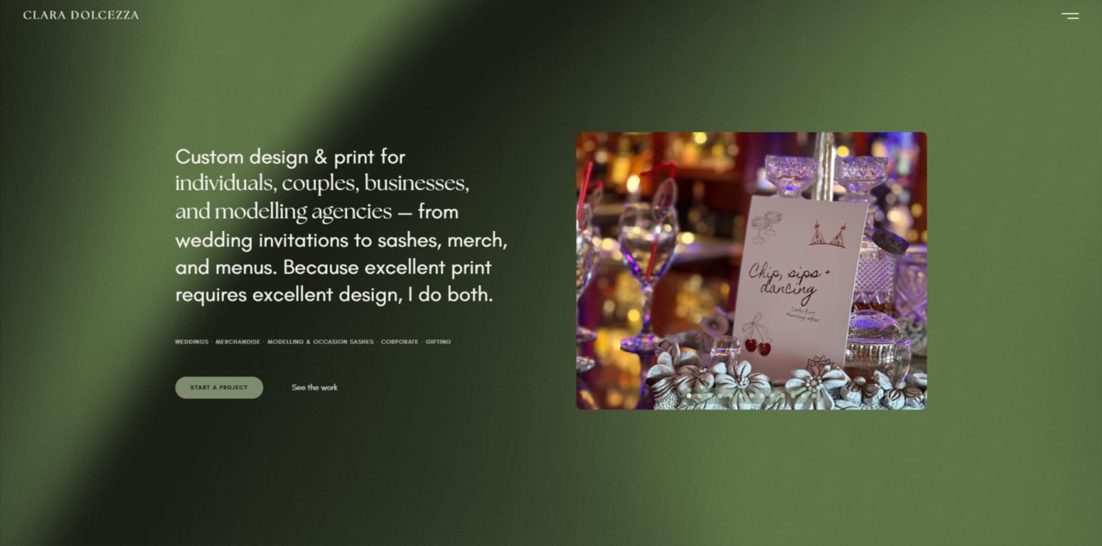
Clara Dolcezza is a Johannesburg design & print studio with real clients and a strong body of work — but no website. Simply Begin built their first one from scratch: a dark, editorial site that turns a scattered offering into one clear, bookable brand.
Five things it does. One place that finally shows them all.
Clara Dolcezza makes lovely things. It's a design and print studio in Johannesburg, and the range of what comes out of it is genuinely wide — wedding invitations, branded merchandise, occasion sashes, corporate print, and gifting, all custom, much of it made by hand. Modelling agencies like ACE Models come to the studio for sashes and branded pieces. Businesses like RE/MAX and BetterBond come for staff kit. Couples come for the stationery that sets the tone for the biggest day of their year. The clients clearly adore the work — the reviews say as much. This was already a real, well-loved business.
What it didn't have yet was a home online. Everything lived on Instagram and Facebook, which is where a lot of small businesses begin, and for a while it works beautifully — the work is visible, people can message, orders come in. But a social feed can only ever show your most recent post. It doesn't hold still, and it doesn't easily let someone who found you through one thing discover the other four. A couple who came across Clara Dolcezza through a wedding invitation might never realise the studio also brands corporate uniforms. A business that ordered branded mugs might never see the full wedding suites. Five distinct offerings, each one quietly getting lost behind the last post.
Because there was no existing site, the first job wasn't design at all — it was working out, together, how to say what the studio is. That's the interesting challenge with a business this varied. Lead only with the best-known thing, weddings, and the rest disappears. Flatten it all into a vague "we do print" and nothing speaks to anyone in particular. What I landed on leads with the range itself, held together by something the studio says in its own voice: excellent print requires excellent design, and it does both. Weddings still take pride of place — they're the flagship and the heart of the work — but merchandise, modelling and occasion sashes, corporate, and gifting each earn their own clear space, so whoever arrives finds themselves in it.
From there, the site was shaped around the questions a first-time visitor is actually asking. Who is this for? What does it make? Can I see it? Is it any good? How do I start? Each gets answered in turn. A filterable gallery lets visitors sort the work by category, so someone who came for one thing immediately discovers the rest. A services section lays out all five offerings with the real detail underneath — not just "stationery," but save-the-dates, menus, table numbers, seating charts, welcome signs, bridesmaid and groomsmen boxes. A print-types section names the actual mediums the studio works in: heat transfer vinyl, DTF, sublimation, embroidery, UV DTF, UV printing. A simple four-step order process takes the mystery out of getting started. And the reviews are real Google reviews — named, five-star, from couples, agencies, and businesses the studio has genuinely worked with.
The design decision that does the most quiet work is one most people won't consciously register. The site is built dark, and that's very deliberate. The studio's product photography is colourful and full of life — sage-green sashes, printed mugs, wedding tablescapes, branded jackets — and a dark, calm interface steps back and lets all of that colour come forward. A busier, more decorated site would have competed with the work. This one frames it. The typography leans editorial and unhurried, more like a printed lookbook than a standard small-business template, which felt right for a studio whose whole belief is that print and design are one craft. The existing brand touches carry through too — the olive-branch motif from the studio's socials, the scripture line it has always kept close. The result feels unmistakably like Clara Dolcezza, because it is.
It went live on its own domain in about two weeks, as a multi-page site: a hero, the gallery, services, print types, the order process, testimonials, a working enquiry form, FAQs, and a footer that ends on a single warm note — "Let's begin." Every piece in the gallery is real work. Every review is a real client. The contact form goes straight through, alongside direct WhatsApp, Instagram, and Facebook links, so getting in touch is as easy as possible.
Clara Dolcezza now has a home of its own that shows the full breadth of what it does, backs it up with real clients and real reviews, and gives every visitor a clear, friendly path from "who is this?" to "let's start something." The work was always there. Now there's a place that does it justice — one where people who'd never have pieced the whole picture together from Instagram can find the studio, understand it, and book it.
It was always this good. Now the website says so too.
Keep looking